


Black Friday in IT: When Every Day is a Deadline | Why Your Team Has No Right to Fail - And How It Kills Innovation
Issue #39


In today's edition, among other things:
💜 Black Friday in IT: When Every Day is a Deadline (by
)💜 Why Your Team Has No Right to Fail - And How It Kills Innovation (by
)💪 Interesting opportunities to work in product management
🍪 Product Bites - small portions of product knowledge
📚 Monthly Book Club for Product Managers
🔥 MLA week#25
Join Premium to get access to all content.
It will take you almost an hour to read this issue. Lots of content (or meat)! (For vegans - lots of tofu!).
Grab a notebook 📰 and your favorite beverage 🍵☕.
Editor’s Note by Alex 💜
The Discovery Trap: A Tactical Guide to Breaking Product Management's Most Expensive Addiction
Here's the uncomfortable truth nobody wants to admit: Your discovery process has become an elaborate procrastination mechanism. Is no longer serving your team and clients - it’s ritual you keep to avoid real product work.
I've watched brilliant product teams transform into research departments, spending months perfecting their discovery rituals while their competitors ship, iterate, and win. We've convinced ourselves that more research equals better decisions, but the data tells a different story. While the precise ROI multipliers vary by industry and context, research consistently shows that companies focusing on systematic evaluation and optimization of existing capabilities outperform those trapped in endless discovery cycles, yet most product teams can't even measure how much time they waste on discovery theater.
This isn't about eliminating discovery—it's about building systematic approaches that know when to research and when to execute. The frameworks exist, the metrics are measurable, and the organizational changes are achievable. What's missing is the courage to admit that our industry's discovery obsession is systematically destroying value.
The Discovery Audit: Measuring Your Addiction
Before you can solve the problem, you need to see it clearly. Most product teams have no idea how much time they actually spend on discovery versus execution, which makes optimization impossible.
Start with the Discovery Time Audit. Track every hour your team spends on research, interviews, experiments, and analysis for two weeks. Include planning time, synthesis time, and the endless meetings where you discuss what you learned. Most teams discover they're spending 40-60% of their time on discovery activities—far above the optimal 20-30% that research suggests.
Implement the Decision Velocity Metric. Count how many meaningful product decisions your team makes per week. Not small tweaks or bug fixes—actual decisions that change user experience or business outcomes. While optimal velocity varies by team size and product complexity, consistent teams typically make multiple significant decisions weekly. Discovery-trapped teams often make fewer than one per month because they're always "gathering more data."
Calculate your Research-to-Action Ratio. For every customer interview, user test, or experiment, track what specific action resulted. A healthy ratio is 1:1—every research activity should generate a concrete decision or change. Teams trapped in discovery theater often have ratios of 3:1 or worse, conducting multiple research activities for every meaningful action.
Measure Discovery Debt. Just like technical debt, discovery debt accumulates when you start new research before acting on previous insights. Track the backlog of "insights" and "learnings" that haven't been translated into product changes. Discovery debt accumulating over several weeks indicates your team is researching faster than they can execute.
The Decision Framework: When to Discover vs When to Execute
The most successful product teams don't do more discovery—they do smarter discovery. They've built systematic frameworks for deciding when additional research adds value versus when it becomes expensive procrastination.
Use the Confidence-Impact Matrix. Before any discovery activity, plot your current confidence level (0-100%) against the potential impact of being wrong. High-impact, low-confidence decisions justify research investment. Low-impact or high-confidence decisions need immediate action, not more analysis. This simple framework eliminates significant amounts of unnecessary research.
Implement Discovery Time Boxes. Every research initiative gets a maximum time limit—typically 1-2 weeks for most decisions. If you can't reach sufficient confidence within the time box, you probably have a strategy problem, not an information problem. Time boxes force teams to focus on decision-relevant research rather than interesting-but-irrelevant insights.
Apply the "Good Enough" Standard. Research perfectionism kills velocity. Most product decisions require 70% confidence, not 95%. Build explicit confidence thresholds into your process: 70% = ship it, 50-70% = small test, below 50% = more research. This prevents teams from over-researching decisions that don't warrant it.
Create Discovery Budgets. Allocate specific percentages of sprint capacity to discovery: 70% execution, 20% evaluation of existing features, 10% new discovery. When the discovery budget is spent, you ship what you have. This forces prioritization of research activities and prevents discovery from consuming unlimited resources.
The Systematic Dismantling of Discovery Theater
Popular product methodologies have created elaborate rituals that feel productive but generate minimal value. Fixing this requires systematically identifying where these frameworks break down and building better alternatives.
Continuous Discovery Habits: When Ritual Replaces Insight
Teresa Torres' continuous discovery habits have become gospel in many organizations, but the implementation often devolves into checkbox exercises. Teams conduct weekly customer interviews not because they need specific insights, but because the framework says they should. This creates what researchers call "pseudo-research"—activities that look like discovery but lack clear decision-making purpose.
The fix requires intentional discovery planning. Before any customer interaction, document the specific decision you're trying to make and what information would change your mind. If you can't articulate both, skip the research. Implement "insight accountability"—every research session must generate at least one actionable finding that influences a product decision within two weeks.
Design Thinking: The Post-It Note Fallacy
Design thinking has been criticized by actual designers as "bullshit" that reduces complex creative work to linear processes anyone can follow. The methodology creates an illusion of innovation through workshops and ideation sessions while avoiding the difficult work of execution and iteration.
The deeper problem is what psychologists call "substitution bias"—teams substitute the easier task (generating ideas) for the harder one (implementing solutions). Design thinking workshops generate dozens of concepts but rarely provide frameworks for systematic evaluation and prioritization. Teams feel innovative without creating value.
Replace design thinking workshops with evaluation sessions focused on existing user pain points. Instead of brainstorming new solutions, systematically analyze why current solutions fail and how to fix them. This shifts energy from ideation to implementation while maintaining creative problem-solving.
Lean Startup: When "Fail Fast" Becomes "Never Ship"
The lean startup methodology has created its own pathologies through misapplication. "Build-measure-learn" loops become endless cycles where teams build more experiments instead of building products. The emphasis on "validated learning" can prevent teams from making necessary decisions with imperfect information.
Research shows that rapid iteration favors incremental improvements over breakthrough innovations. When applied inappropriately to complex problems, lean startup prevents the sustained effort that meaningful innovation requires. General Electric's FastWorks program, heavily based on lean principles, contributed to strategic failures as the company over-emphasized rapid iteration over deep technical innovation.
Implement "learning budgets" that limit experimentation time. After three build-measure-learn cycles, teams must ship a solution or kill the initiative. This prevents endless iteration and forces decisive action based on available evidence.
Organizational Change: Building Evaluation Excellence
The deepest challenge isn't tactical—it's cultural. Most organizations have built reward systems, meeting structures, and success metrics that systematically encourage discovery theater while punishing execution focus.
Redesign Success Metrics
Traditional product metrics reward research activity over business outcomes. Teams get credit for conducting user interviews, running experiments, and generating insights—regardless of whether these activities translate to better products or business results.
Replace activity metrics with outcome metrics. Instead of measuring "customer interviews conducted," measure "customer problems solved." Instead of tracking "experiments run," track "features shipped that improve key metrics." This fundamental shift in measurement drives different behavior.
Implement "solution velocity" tracking—how quickly teams move from problem identification to shipped solution. High-performing teams complete this cycle efficiently, often within weeks rather than months. Discovery-trapped teams often take much longer, indicating systematic over-research.
Transform Meeting Structures
Most product organizations have built meeting cadences that reinforce discovery bias. Research reviews, insight sharing sessions, and discovery planning meetings consume enormous calendar space while execution updates get squeezed into brief status checks.
Flip the meeting ratio to match optimal resource allocation: 70% of meeting time focused on execution progress, 20% on evaluation of existing features, 10% on new discovery. This sends clear signals about organizational priorities while ensuring discovery remains appropriate to business needs.
Create "decision meetings" specifically focused on making choices with available information. These meetings have explicit confidence thresholds and predetermined action items. If the team reaches the confidence threshold, they commit to a decision. If not, they define specific information needs and time boxes for gathering it.
Build Evaluation Expertise
Most product teams have sophisticated discovery capabilities but primitive evaluation skills. They can design experiments but struggle to systematically analyze existing feature performance. They can conduct user interviews but can't rigorously assess whether current solutions work for users.
Develop evaluation frameworks as sophisticated as your discovery methods. Train teams on systematic approaches to feature performance analysis, user satisfaction assessment, and business impact measurement. This creates organizational capacity for optimization rather than just exploration.
Implement "evaluation sprints" focused exclusively on improving existing features. Run these parallel to discovery activities to maintain balance between exploration and optimization. Teams often discover that evaluation sprints generate higher ROI than discovery sprints because they build on proven foundations.
Manage Stakeholder Expectations
Senior leadership often perpetuates discovery theater through their own biases toward novelty and innovation theater. Executives ask for "more research" or "additional validation" when they're actually avoiding difficult decisions or managing their own risk aversion.
Educate leadership on the costs of over-discovery: opportunity cost, technical debt accumulation, team frustration, and customer dissatisfaction with constantly changing products. Provide frameworks for understanding when additional research adds value versus when it becomes expensive procrastination.
Create "decision packages" that present research findings alongside clear recommendations and confidence levels. This helps executives make informed choices about whether additional research is warranted or whether the team should proceed with available information.
The Implementation Playbook
Breaking free from discovery addiction requires systematic change management, not just individual behavior modification. Here's the step-by-step approach that works:
Week 1-2: Assessment and Measurement
Conduct discovery time audit across all product teams
Calculate current research-to-action ratios
Measure decision velocity and discovery debt
Document current meeting time allocation
Week 3-4: Framework Implementation
Introduce confidence-impact matrix for all research decisions
Implement discovery time boxes and budgets
Create evaluation sprint processes
Establish new success metrics focused on outcomes
Week 5-8: Cultural Reinforcement
Redesign meeting structures to match 70-20-10 allocation
Train teams on evaluation methodologies
Create decision-making frameworks with explicit confidence thresholds
Begin tracking solution velocity metrics
Week 9-12: Optimization and Scaling
Analyze results from new frameworks
Adjust time boxes and budgets based on team performance
Scale successful approaches across organization
Develop advanced evaluation capabilities
The transformation isn't immediate, but the results compound quickly. Teams typically see significant improvement in shipping velocity within the first quarter, with continued gains as evaluation expertise develops.
Beyond the Discovery Delusion
The product management community's discovery obsession has created systematic value destruction disguised as customer focus. But the solution isn't complex—it requires disciplined application of frameworks that balance exploration with execution, measurement systems that reward outcomes over activities, and organizational changes that support evaluation excellence.
The companies winning in today's market haven't mastered discovery—they've mastered the art of making decisions with imperfect information and iterating based on real user feedback rather than research theater. They've built cultures that celebrate shipping solutions, not gathering insights.
Your customers don't need you to understand them better—they need you to solve their problems faster. Your business doesn't need more opportunities—it needs better execution on current opportunities. The frameworks exist to make this transition, but it requires acknowledging that our industry's research addiction is preventing us from building the products our users actually need.
The discovery delusion ends when we start measuring success by value delivered, not insights gathered. Everything else is just expensive procrastination.
💪 Product job ads from last week
Do you need support with recruitment, career change, or building your career? Schedule a free coffee chat to talk things over :)
Product Manager - Corporate Tools LLC
Product Manager - SoFi
Product Manager - Artera
Product Manager - The PNC Financial Services Group
Principal Product Manager - Upstart
🍪 Product Bites (3 bites 🍪)
🍪 Attention Restoration Theory in UX

How Products Can Heal Rather Than Drain Our Digital Minds
In an era where the average knowledge worker checks email every 12 minutes and switches between applications over 300 times per day, we're witnessing an unprecedented crisis of cognitive exhaustion. While most products compete for attention like hungry parasites, the most successful ones are beginning to understand a counterintuitive truth: the products that restore attention create more value than those that consume it.
Attention Restoration Theory (ART), developed by environmental psychologists Rachel and Stephen Kaplan, reveals that our capacity for focused attention operates like a muscle—it fatigues with use and requires specific conditions to recover. But here's what most product teams miss: digital products can either accelerate this fatigue or actively participate in the restoration process.
The Attention Economy's Hidden Cost
Traditional UX design optimizes for engagement metrics—time on site, clicks per session, daily active users. These metrics, while commercially valuable, often mask a deeper problem: they measure attention extraction, not attention satisfaction. Users leave our products more mentally depleted than when they arrived, creating what researchers call "continuous partial attention"—a state where we're constantly monitoring multiple information streams without fully engaging with any.
Consider this: studies show that after an interruption, it takes an average of 23 minutes to fully refocus on the original task. Yet the average smartphone user receives 80 push notifications per day. We're designing products that systematically undermine the very cognitive resources our users need to be successful in their work and life.
The companies that recognize this pattern are discovering something remarkable: products designed for attention restoration don't just feel better to use—they create stronger user loyalty, higher lifetime value, and more sustainable business models.
The Four Pillars of Restorative Design
Attention Restoration Theory identifies four key elements that help restore directed attention capacity. Smart product teams are translating these into digital design principles:
Being Away (Mental Distance) Products that provide psychological distance from demanding tasks help users recover cognitive resources. Headspace doesn't just offer meditation—it creates a distinct mental space separate from the user's everyday concerns. The app's visual design, interaction patterns, and content architecture all signal "you're in a different place now."
Spotify's Discover Weekly works similarly, creating a dedicated space for musical exploration that feels separate from the goal-driven playlist creation that dominates the rest of the platform.
Fascination (Effortless Attention) Restorative experiences capture attention without requiring effort. Instagram's early success wasn't just about photo sharing—it was about creating an endless stream of visually fascinating content that could hold attention without demanding cognitive work.
The key distinction: effortless attention feels engaging without being exhausting. TikTok masters this with its algorithm-driven feed that requires no decision-making from users about what to watch next.
Extent (Coherent Environments) Restorative products create rich, immersive environments that feel complete and coherent. Notion succeeds not just because it's a powerful productivity tool, but because it creates an all-encompassing workspace that feels like a coherent digital environment rather than a collection of disconnected features.
Video games have always understood this principle. The most engaging games create complete worlds with their own internal logic, allowing players to fully immerse themselves without cognitive overhead from inconsistent interfaces or jarring transitions.
Compatibility (Purpose Alignment) The most restorative digital experiences align with users' intrinsic motivations and natural inclinations. Duolingo's game-like language learning doesn't just make education fun—it creates an experience compatible with how humans naturally learn through play and repetition.
LinkedIn's recent shift toward more conversational, community-driven content represents an understanding that professional networking is more restorative when it aligns with humans' natural desire for meaningful connection rather than transactional relationship-building.
The Restoration Design Framework
Building restorative products requires a fundamental shift in how we approach user experience design. Here's a practical framework for teams ready to make this transition:
Audit Your Attention Impact Start by measuring the cognitive load your product creates. Track metrics beyond engagement: How do users feel before and after using your product? What's their error rate on subsequent tasks? Are they more or less focused after extended use?
Create "attention impact statements" for major features. Just as we consider the environmental impact of our choices, we should consider the cognitive impact of our design decisions.
Design Transition Rituals Build explicit mechanisms that help users transition into and out of your product. Cal Newport's concept of "shutdown rituals" applies to product design—users need clear signals that help them mentally transition between different types of cognitive work.
Slack's "set your status" feature isn't just about availability—it's a micro-ritual that helps users mentally transition into "collaboration mode." The most successful remote work tools understand that the absence of physical transitions between workspaces requires more intentional digital transitions.
Create Cognitive Breathing Room Build in natural pauses and reflection points. Reflect, a journaling app, doesn't just capture user input—it creates structured moments for mental processing. After each entry, users see a brief summary screen that encourages reflection before moving on.
This principle extends to interface design: white space isn't just aesthetic—it provides cognitive breathing room that helps users process information without feeling overwhelmed.
Optimize for Satisfaction, Not Addiction Design completion states that feel genuinely satisfying. Instagram's infinite scroll keeps users engaged but rarely leaves them feeling satisfied. In contrast, Headspace sessions have clear endpoints that leave users feeling accomplished and restored.
The distinction matters: addictive design creates dependency, while restorative design builds capacity. Users should leave your product feeling more capable, not more dependent.
The Business Case for Restoration
Companies implementing restorative design principles are discovering that helping users restore attention creates sustainable competitive advantages. When users associate your product with feeling better rather than feeling drained, you build emotional loyalty that transcends feature comparisons.
Calm's valuation of over $2 billion isn't just about meditation content—it's about being the product that users turn to when they need cognitive restoration. The app has become synonymous with mental relief in the same way that Kleenex became synonymous with tissues.
Forest, an app that helps users stay focused by growing virtual trees during work sessions, demonstrates how restorative design can create viral growth. Users don't just use Forest—they evangelize it because it genuinely helps them feel more capable and focused.
The Restorative Product Principle
The future belongs to products that understand a fundamental truth: in an attention-scarce world, the most valuable products aren't those that capture the most attention, but those that help users use their attention more effectively.
This doesn't mean sacrificing engagement or commercial success. It means recognizing that sustainable engagement comes from products that leave users feeling more capable, not more depleted. When we design for attention restoration, we create products that users don't just use—they recommend, defend, and build their workflows around.
The question isn't whether your users have enough attention to engage with your product. The question is whether your product helps them cultivate the attention they need to thrive in an increasingly demanding world. In answering that question lies the difference between products that extract value and products that create it.
🍪 The False Consensus Effect in Product Teams

Why Everyone Thinks Their Preferences Are Universal (And How It Kills Products)
Every product manager has lived this nightmare: You launch a feature your team loves, backed by solid internal testing and enthusiastic stakeholder buy-in. Yet users ignore it, complain about it, or worse—abandon your product entirely. The post-mortem reveals a painful truth: your team was designing for yourselves, not your users.
This isn't incompetence—it's psychology. The False Consensus Effect, first identified by social psychologist Lee Ross, describes our tendency to overestimate how much others share our beliefs, preferences, and behaviors. In product development, this cognitive bias transforms well-intentioned teams into echo chambers that build products for an audience of one: themselves.
The cost is staggering. Research by CB Insights shows that 35% of startup failures stem from building products nobody wants. But the problem isn't just about market demand—it's about our fundamental inability to step outside our own cognitive bubbles when making product decisions.
The Anatomy of False Consensus in Product Development
False consensus manifests in product teams through several predictable patterns, each more dangerous than the last.
The Expert User Trap Product teams are filled with power users who've internalized complex workflows and technical concepts. What feels intuitive to them often bewilders ordinary users. Slack's early versions were beloved by engineering teams but struggled with adoption among non-technical users who found the interface overwhelming. The company's breakthrough came when they realized they were designing for themselves—tech-savvy early adopters—rather than the broader market of workplace communicators.
The Feature-Rich Fallacy Teams assume users want more features because they themselves enjoy exploring new capabilities. This leads to feature bloat that satisfies internal stakeholders while confusing actual users. Microsoft Word's ribbon interface was partly a response to this problem—users were only discovering about 10% of available features because the traditional menu system had become incomprehensible to anyone except power users.
The Demographic Mirror Product teams often skew toward specific demographics—young, urban, tech-savvy professionals. When these teams design products, they unconsciously optimize for their own demographic characteristics. Instagram's early focus on high-quality photography reflected its founders' background in design and photography. The app's evolution toward more casual, authentic content came only after realizing that most users weren't professional photographers.
The Context Collapse Teams work in optimal environments—high-end devices, fast internet, distraction-free offices. Users live in the real world of cracked screens, spotty connections, and constant interruptions. Google's early mobile products struggled because they were designed in Mountain View's pristine campus environment, not tested in the chaos of actual mobile usage contexts.
The Consensus Cascade
False consensus doesn't just affect individual decisions—it creates cascading effects that compound throughout the product development process.
Research Confirmation Bias When teams conduct user research, they unconsciously structure questions and interpret results in ways that confirm their existing beliefs. A team that believes users want more customization options will design research that validates this assumption, missing evidence that users actually want simpler, more opinionated interfaces.
Stakeholder Alignment Illusion Internal stakeholders—executives, sales teams, support staff—often share similar backgrounds and preferences with the product team. Their alignment creates a false sense of market validation. The team feels confident because "everyone" agrees, not realizing that "everyone" represents a tiny, unrepresentative sample of the actual user base.
The Feedback Loop Paradox The most vocal users—those who provide feedback, join beta programs, and engage with the product team—tend to be outliers who don't represent the broader user base. Teams mistake feedback from these engaged users for universal preferences, leading to products that satisfy the most vocal 5% while alienating the silent 95%.
Breaking the False Consensus Cycle
Overcoming false consensus requires systematic approaches that force teams to confront their own biases and assumptions.
Systematic Perspective Taking Netflix's product team uses a technique called "persona displacement"—before making any major design decision, team members must explicitly roleplay as different user types with different goals, contexts, and constraints. This isn't about superficial demographics but about genuinely different usage patterns and mental models.
The key is making this process mandatory and specific. Instead of asking "what would users want?" teams ask "what would a single mother with limited time and an older Android phone want?" The specificity forces teams to think beyond their own experience.
Assumption Mapping and Testing Successful teams explicitly document their assumptions and test them systematically. Spotify's discovery team maintains an "assumption register" where they log beliefs about user behavior, then design small experiments to validate or refute each assumption.
This process revealed that their assumption about users wanting more music discovery features was false—most users actually wanted better ways to rediscover music they already knew they liked but had forgotten about.
Diverse Decision-Making Processes Teams that regularly include people from different backgrounds in product decisions make better choices. But diversity isn't just about demographics—it's about cognitive diversity. Include customer support representatives who hear user complaints, data analysts who see usage patterns, and yes, actual users in your decision-making process.
Airbnb's product team includes hosts and guests in their design reviews, not just as feedback providers but as active participants in the decision-making process. This practice has prevented numerous features that would have satisfied the team's assumptions while creating problems for actual users.
Behavioral Data Over Stated Preferences What users say they want often differs from what they actually use. Teams that rely too heavily on surveys and interviews fall into false consensus traps because they're getting filtered, rationalized responses rather than honest behavioral data.
TikTok's algorithm famously ignores what users say they want and focuses entirely on what they actually engage with. The result is a product that feels almost magically aligned with user preferences, precisely because it doesn't rely on users' conscious self-reporting.
The Empathy Infrastructure
Building products that serve diverse users requires more than good intentions—it requires systematic empathy infrastructure that makes diverse perspectives visible and actionable.
Regular User Immersion Every product team member should spend time regularly observing and interacting with users in their natural contexts. This isn't about formal user research—it's about maintaining contact with the reality of how people actually use products.
Intuit requires all employees, including executives, to spend time watching users navigate their products without guidance. This practice has prevented countless features that seemed obvious to the team but confusing to users.
Diverse Testing Environments Test your product in conditions that mirror your users' reality, not your ideal environment. This means testing on older devices, slower networks, and in distracting environments. It means considering users who are multitasking, stressed, or using your product in ways you never intended.
WhatsApp's success in emerging markets came partly from their obsession with testing on older Android devices with limited data plans—conditions that most Silicon Valley teams never experience but that represent the majority of global smartphone users.
Feedback System Redesign Create feedback systems that capture input from your quiet users, not just your vocal ones. This might mean in-app surveys that trigger based on usage patterns rather than user self-selection, or reaching out to users who've reduced their usage rather than just those who are highly engaged.
The Consensus Reality Check
The most effective teams develop systematic ways to challenge their own assumptions and expose false consensus before it becomes embedded in product decisions.
The Outsider Test Regularly bring in people who've never seen your product and observe their first interactions. Not in a formal usability test, but in a natural context where they're trying to accomplish real goals. Their confusion, questions, and unexpected behaviors reveal assumptions your team didn't know they were making.
The Constraint Challenge Deliberately impose constraints that force you to design for different contexts. What if your users only had 2G internet? What if they were using your product while holding a baby? What if they only had 30 seconds to accomplish their goal? These constraints reveal how much your current design assumes about user context and capabilities.
The Demographic Flip Regularly ask: "What if our primary user were the opposite of our team?" If your team is young, design for older users. If you're urban, design for rural contexts. If you're tech-savvy, design for tech-averse users. This thought experiment often reveals features and interface decisions that only make sense to people like you.
The Consensus Accountability Framework
False consensus isn't just a design problem—it's an organizational problem that requires systematic accountability measures.
Decision Documentation Require teams to explicitly document the user assumptions behind major product decisions. This creates a paper trail that can be reviewed during post-mortems and helps identify patterns of false consensus over time.
Diverse Success Metrics Don't just measure overall engagement—measure engagement across different user segments. If a feature is popular among your most engaged users but ignored by newer or less frequent users, you may be falling into false consensus patterns.
Regular Assumption Audits Periodically review past product decisions and their outcomes. Which assumptions proved false? What patterns emerge? Teams that systematically learn from their false consensus mistakes become better at avoiding them in the future.
The Consensus Paradox Resolution
The deepest insight about false consensus is paradoxical: the more we try to design for "everyone," the more we end up designing for ourselves. The solution isn't to eliminate all assumptions—that's impossible. Instead, we must become better at recognizing our assumptions and systematically testing them against diverse user realities.
The most successful products aren't those built by teams who never fall into false consensus—they're built by teams who've developed systems for quickly recognizing and correcting their consensus biases. In a world of infinite user diversity, the team that can most quickly escape their own cognitive bubbles wins.
Remember: every product decision is a bet about what users want. False consensus makes us feel more confident about these bets while making them objectively worse. The antidote isn't more confidence—it's better systems for testing our assumptions against the beautiful, messy reality of human diversity.
🍪 The Decoy Effect in Product Positioning

How Adding a "Worse" Option Makes Users Choose Exactly What You Want
In 2008, The Economist ran a subscription offer that seemed bizarrely irrational: $59 for digital access, $125 for print only, or $125 for both digital and print. Why would anyone choose print-only when they could get both for the same price? They wouldn't—and that was exactly the point. When behavioral economist Dan Ariely tested this pricing structure, he discovered something remarkable: the presence of the obviously inferior print-only option doubled sales of the combined subscription.
This isn't an accident—it's the Decoy Effect, one of the most powerful yet underutilized tools in product positioning. Also known as asymmetric dominance, this cognitive bias makes users choose a specific option by introducing a strategically inferior alternative that makes your preferred choice look irresistibly attractive.
The implications for product teams are profound. In a world where users face analysis paralysis from too many choices, the decoy effect offers a elegant solution: guide decision-making without restricting options, increase perceived value without changing actual features, and boost revenue while improving user satisfaction.
The Psychology of Comparative Decision Making
Human decision-making is fundamentally comparative. We don't evaluate options in isolation—we judge them relative to alternatives. This creates an opportunity for product teams who understand how to structure choices.
The decoy effect works because of three psychological principles working in concert:
Reference Dependence Users evaluate products relative to reference points, not absolute value. A $99 software plan feels expensive until you see a $199 alternative with similar features. Suddenly, the $99 option feels like a smart choice, even though nothing about it has actually changed.
Loss Aversion People feel the pain of missing out twice as intensely as they feel the joy of gaining. A decoy option that's clearly inferior makes users feel like they're "losing value" if they don't choose the obviously superior alternative.
Cognitive Ease When faced with complex decisions, our brains look for shortcuts. A decoy creates an obvious "right choice," reducing cognitive load and decision anxiety. Users feel confident they've made a smart decision because the comparison is clear.
Decoy Architectures in Digital Products
The most sophisticated product teams embed decoy effects throughout their user experience, from pricing tables to feature selection to onboarding flows.
The Classic Pricing Decoy Adobe's Creative Cloud pricing historically included individual app subscriptions ($20.99/month for Photoshop), the complete Creative Suite ($52.99/month), and a "Photography Plan" bundle ($9.99/month for Photoshop + Lightroom). The individual Photoshop subscription serves as a decoy—it's clearly inferior value compared to getting Photoshop plus Lightroom for half the price. This drives users toward either the Photography Plan (higher adoption) or the complete suite (higher revenue).
Feature Tier Decoys Slack's pricing structure brilliantly uses feature limitations as decoys. The free tier allows 10,000 message history—enough to be useful but creates anxiety about losing messages. The "Pro" tier removes this limitation plus adds integrations and guest access. The "Business+" tier adds compliance features most teams don't need. The middle tier becomes the obvious choice because it solves the clear pain point (message limits) without paying for unused enterprise features.
Implementation Complexity Decoys Many SaaS products position their managed services by showing the complexity of self-implementation. Stripe's pricing page doesn't just show subscription fees—it compares them against the "build your own" option, listing months of development time, compliance requirements, and ongoing maintenance. The message is clear: pay us $0.05 per transaction or spend six months building what we already have.
The Subscription Psychology Playbook
Subscription products have perfected decoy positioning because recurring revenue makes optimization especially valuable.
Volume Decoys Netflix historically offered a "Basic" plan (one screen, standard definition), "Standard" (two screens, HD), and "Premium" (four screens, Ultra HD). Most households don't need four screens, but they definitely need HD and might want two simultaneous streams. The Premium tier makes Standard feel sensible while the Basic tier makes it feel like a no-brainer upgrade.
Duration Decoys Many products offer monthly, annual, and sometimes quarterly billing options. The quarterly option often serves as a decoy—it's not long enough to justify a significant discount but makes the annual plan look like better value. Users who might hesitate at a 12-month commitment readily choose it when comparing against quarterly pricing.
Access Level Decoys GitHub's pricing structure positions individual developer accounts against team features. The "Pro" individual plan includes private repositories and advanced code review, while "Team" adds organization-level permissions and project management. Solo developers might not immediately see the value in team features, but the comparison makes Pro feel essential for serious development work.
Mobile App Monetization Decoys
Mobile apps have unique opportunities for decoy positioning, especially in freemium models.
Content Unlock Decoys Duolingo offers gems (premium currency) in different packages: 350 gems for $4.99, 750 gems for $9.99, or 1200 gems for $14.99. The middle option serves as an anchor that makes the largest package feel like better value while making the smallest feel insufficient. Users gravitate toward the "best value" option even when they might have been satisfied with less.
Time-Based Decoys Many productivity apps offer premium subscriptions with different billing cycles: $2.99/month, $19.99/year (equivalent to $1.67/month), or $39.99 for lifetime access. The monthly option serves as a decoy to highlight the annual savings, while the lifetime option anchors the annual price as reasonable recurring payment.
Feature Access Decoys Notion's pricing includes a "Personal" free tier with limitations, "Personal Pro" for individuals, and "Team" for collaboration. Personal Pro removes blocks limits and adds file uploads, while Team adds admin controls and advanced permissions. For individual users, the Team features serve as a decoy that makes Personal Pro feel perfectly sized.
The Onboarding Choice Architecture
Decoy effects are particularly powerful during onboarding when users are making foundational decisions about how they'll use your product.
Template Selection Decoys When users sign up for design tools like Canva, they're often presented with template options ranging from "Blank Canvas" to "Professional Templates" to "Premium Designs." The blank canvas serves as a decoy that makes professional templates feel helpful, while premium designs anchor the professional tier as accessible.
Account Type Decoys Business software often presents account types during signup: "Individual," "Small Team," and "Enterprise." Even solo users often choose Small Team because Individual feels limiting while Enterprise feels excessive. The pricing and features are structured to make Small Team feel like the smart, future-proof choice.
Integration Depth Decoys During onboarding, many products offer different levels of integration: "Basic Setup" (5 minutes), "Recommended Setup" (15 minutes), or "Advanced Setup" (30+ minutes). Basic feels insufficient while Advanced feels overwhelming, driving users toward Recommended even if they might have been satisfied with less initial configuration.
Ethical Decoy Implementation
The power of decoy effects raises important ethical considerations. The goal should be guiding users toward options that genuinely serve their needs, not manipulating them into overspending.
Value-Aligned Decoys The best decoy strategies align with genuine user value. When Zoom positions its "Basic" free plan against "Pro" paid plans, the limitations (40-minute meeting limit, no cloud recording) represent real usage thresholds where paid features create meaningful value. The decoy guides users toward appropriate service levels rather than unnecessary upgrades.
Transparent Positioning Ethical decoy implementation maintains transparency about what users actually need. Apple's iCloud storage tiers (5GB free, 50GB for $0.99, 200GB for $2.99, 2TB for $9.99) include usage guidance that helps users understand their actual storage needs rather than just pushing toward higher tiers.
Exit Ramp Clarity Good decoy positioning includes clear paths for users who realize they've chosen more than they need. Spotify makes it easy to downgrade from Premium to Free, which builds trust and reduces signup friction because users know they're not locked into overbuying.
The Decoy Testing Framework
Implementing decoy effects requires systematic testing because the optimal positioning varies by audience, product, and market conditions.
A/B Testing Positioning Test different decoy positions within your pricing structure. Sometimes the decoy should be the lowest tier (making middle feel sensible), sometimes the highest (making middle feel accessible), and sometimes an off-tier option (like the Economist's print-only plan) that exists purely to influence comparison.
Segment-Specific Decoys Different user segments respond to different decoys. Enterprise customers might be influenced by security and compliance features they don't need, while individual users might be influenced by collaboration features they won't use. Tailor your decoy positioning to your audience's specific anxieties and aspirations.
Dynamic Decoy Adjustment The most sophisticated implementations adjust decoy positioning based on user behavior and market feedback. If usage data shows that users consistently upgrade from your "decoy" tier, it might actually be providing real value and should be repositioned as a legitimate option rather than a comparison anchor.
The Paradox of Choice Resolution
The decoy effect solves one of modern product's biggest challenges: helping users choose confidently from increasingly complex option sets. Rather than overwhelming users with feature comparisons or restricting choice through artificial limitations, decoys create choice architecture that feels helpful rather than manipulative.
Cognitive Load Reduction Well-designed decoys reduce decision fatigue by creating obvious "wrong" choices that help users eliminate options quickly. This is particularly valuable in B2B software where feature sets can be overwhelming and decision-makers often involve multiple stakeholders.
Satisfaction Enhancement Users who feel confident about their choices are more satisfied with their purchases. Decoy effects help users feel smart about their decisions, which increases product satisfaction and reduces churn even when the actual product features remain unchanged.
Revenue Optimization Without User Exploitation The most successful decoy implementations increase revenue by guiding users toward options that genuinely serve their needs better, rather than simply extracting more money for equivalent value.
The Strategic Decoy Principle
The deepest insight about decoy effects is that they work best when they guide users toward objectively better choices for their situation. The goal isn't to trick users into overspending—it's to help them navigate complex option sets and choose confidently.
In a world of infinite product choices, the companies that master choice architecture will build stronger relationships with users who feel guided rather than confused, confident rather than anxious, and satisfied rather than regretful about their decisions.
Remember: every product with multiple options is already implementing choice architecture, whether intentionally or not. The question isn't whether to influence user decisions—it's whether to do so thoughtfully, ethically, and in alignment with genuine user value. When done right, decoy effects don't feel like manipulation—they feel like clarity.
📚 Monthly Book Club for Product Managers
"The Paradox of Choice: Why More Is Less" - Barry Schwartz
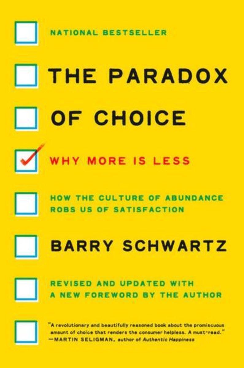
About the Author
Professor Barry Schwartz is a distinguished American psychologist and Professor Emeritus at Swarthmore College, internationally recognized for his expertise in social psychology and decision-making theory. His research focuses on the intersection of psychology, economics, and philosophy, particularly examining how people make choices in complex situations. Schwartz has authored several influential books, including "The Costs of Living" and "Practical Wisdom." His TED talk on "The Paradox of Choice" has been viewed by millions worldwide, cementing his reputation as a leading voice in behavioral psychology. As both researcher and thinker, Schwartz challenges the widespread assumption that more options always lead to better outcomes and greater satisfaction.
Why This Book Is Essential for Product Managers
In an era where every product boasts dozens of features and options, Barry Schwartz presents a counterintuitive and controversial thesis: too much choice can lead to decision paralysis and decreased user satisfaction. For product managers, this perspective is revolutionary and can fundamentally change how we approach product design and think about user experience.
Schwartz argues that while freedom of choice is a fundamental value in modern society, crossing a certain threshold can lead to negative psychological and behavioral consequences. This observation has enormous implications for the world of digital products, where every interface, every feature, and every interaction can potentially overwhelm users with an excess of options.
Key Concepts and Their Application in Product Management:
1. The Tyranny of Small Decisions
Schwartz provides a detailed analysis of how seemingly trivial choices can significantly impact user experience. In the context of digital products, every dropdown, every button, and every menu represents potential friction points. The author demonstrates that the accumulation effect - the build-up of small decisions - can lead to decision fatigue, a state where users simply give up on continuing to use the product.
For product managers, this means taking a critical look at every interface element. Do we really need 15 sorting options in a product list? Are all those toggles in settings truly essential? Schwartz suggests that often the answer is "no," and reducing options can paradoxically increase user satisfaction.
The concept extends beyond interface design to feature planning. Each additional feature represents not just development cost, but cognitive cost for users. The author's research shows that users can become overwhelmed not just by choices within features, but by the sheer number of features available, leading to underutilization of even valuable functionality.
2. Maximizers vs. Satisficers
One of the book's most important concepts is the distinction between maximizers and satisficers. Maximizers are people who always seek the absolute best option, analyzing all available alternatives. Satisficers, on the other hand, choose the first option that meets their minimum criteria.
Schwartz's research shows that satisficers are typically happier and less prone to post-decisional regret. For product managers, this knowledge is invaluable in the context of personalization and user segmentation. Understanding which type of users we're dealing with allows for appropriate adaptation of interfaces and user flows.
Maximizers may need more information and comparison options, but they're also more susceptible to decision paralysis. Satisficers prefer simple, clear recommendations and quick paths to their goals. Products can adapt to these differences by offering different usage modes or intelligently hiding complexity behind optional "advanced" menus.
This segmentation has profound implications for onboarding, feature discovery, and even pricing strategies. Products can identify user types through behavior patterns and adapt accordingly, showing different levels of detail and options based on user preferences.
3. Opportunity Cost and the Mechanism of Regret
Schwartz deeply analyzes the psychological mechanism of opportunity cost - the value of the best possible but unused option. The more options we present to users, the greater the potential opportunity cost of each decision, which can lead to anticipatory regret that paralyzes before making a decision.
In the context of products, this means that even if a user makes a choice, they may be dissatisfied, wondering if another option would have been better. This mechanism is particularly visible in e-commerce, where customers often abandon carts after browsing dozens of similar products.
The author introduces the concept of "regret salience" - how visible and prominent the alternatives are affects the intensity of regret. Smart product design can minimize regret by carefully managing how alternatives are presented and when they're shown.
4. Escalation of Expectations
Schwartz also describes the phenomenon of expectation escalation - when we have more options, our expectations for the perfect choice increase. This leads to situations where even an objectively good decision may bring less satisfaction because our expectations were unrealistically high.
This has significant implications for product marketing and positioning. Features that might delight users in a simple product might seem inadequate when presented alongside numerous alternatives. The context of choice affects not just the decision process, but the satisfaction with the outcome.
Practical Strategies for Product Managers:
Curated Choices Strategy Instead of presenting all available options, create curated choice sets. Netflix doesn't show its entire library on the homepage but creates thematic categories with a limited number of suggestions. This strategy reduces cognitive load while maintaining a sense of choice. The key is intelligent curation based on user behavior, preferences, and context.
Progressive Disclosure Technique Implement gradual revelation of options based on user engagement level. Beginner users see a simplified interface, while advanced users can access additional functionality. This approach serves both satisficers and maximizers by providing appropriate levels of complexity. The challenge lies in determining the right triggers for progressive disclosure and ensuring smooth transitions between levels.
Smart Defaults and Recommended Options Schwartz repeatedly emphasizes the importance of well-designed default settings. Research shows that most users don't change default settings, so careful design can dramatically improve user experience. Additionally, clearly marking "recommended" options helps satisficers make quick decisions. The key is basing defaults on solid user research and behavioral data.
Elimination by Aspects Instead of presenting all options simultaneously, use the elimination by aspects method. Allow users to gradually narrow their choices by specifying preferences. This approach is particularly effective in products with many configurable options. It transforms a potentially overwhelming choice into a series of manageable decisions.
Social Proof and Decision Support Utilize social proof mechanisms to help users make decisions. Information about what other users choose, reviews, and ratings can significantly facilitate the decision process, especially for maximizers who need additional reference points. However, this must be implemented carefully to avoid choice overload through too much social information.
Contextual Option Filtering Use user context, behavior history, and stated preferences to intelligently filter options. Rather than hiding features, present the most relevant ones prominently while keeping others accessible. This approach maintains choice while reducing immediate cognitive load.
Implications for Product Design:
Schwartz demonstrates that design thinking must consider not only what users say they want (more options) but also the psychological consequences of those choices. Often users declare they want more control and options, but in practice, they're happier with simpler, more directed solutions.
This creates a fundamental tension in product development between user requests and user welfare. The book provides frameworks for resolving this tension through intelligent design that provides the benefits of choice without the drawbacks of choice overload.
Measuring Success Differently:
Schwartz also forces a reconsideration of traditional success metrics. Do more page views and longer time spent in the app always mean better user experience? Sometimes this might signal that users are having trouble making decisions and are wandering through the interface looking for the right option.
The book suggests alternative metrics focused on decision confidence, completion rates, and post-decision satisfaction. These metrics might better capture whether choice architecture is truly serving users.
Case Studies and Examples:
The author provides numerous examples from various industries - from supermarkets to retirement systems - showing the universality of the choice paradox problem. For product managers, analyses of technology and digital platforms are particularly valuable, where the translation of theoretical concepts into practical solutions is most direct.
Schwartz examines companies that have successfully implemented choice reduction strategies, showing measurable improvements in user satisfaction and business metrics. These cases provide concrete templates for implementation.
The Business Case for Choice Reduction:
Beyond user psychology, Schwartz makes a compelling business argument for choice reduction. Simpler products often have lower support costs, higher conversion rates, and better user retention. The paradox of choice isn't just about user happiness - it's about business sustainability.
The book provides frameworks for calculating the true cost of additional options, including development, maintenance, support, and opportunity costs from user confusion and abandonment.
Implementation Challenges:
While the theory is compelling, Schwartz acknowledges the practical challenges of implementing choice reduction in real products. Stakeholders often equate more features with more value, and competitive pressure can drive feature proliferation. The book offers strategies for building internal consensus around simplicity and measuring the success of choice reduction initiatives.
Why You Should Read This
"The Paradox of Choice" is more than academic analysis - it's a practical guide to the psychology of modern consumers and users. Schwartz masterfully combines rigorous scientific research with concrete observations from daily life, providing product managers with tools to create products that don't just function, but genuinely improve users' lives.
The book is particularly valuable in the era of "feature creep" - the tendency to add more and more functionality to products. Schwartz provides solid psychological arguments for a "less is more" approach and shows how to implement it practically without sacrificing functionality or personalization.
For product managers operating in competitive markets, the book offers a differentiation strategy based on superior user experience rather than feature parity. In a world where most products are feature-rich, the ones that are intelligently simple often win.
Where to Buy:
🔥 MLA #week 25
The Minimum Lovable Action (MLA) is a tiny, actionable step you can take this week to move your product team forward—no overhauls, no waiting for perfect conditions. Fix a bug, tweak a survey, or act on one piece of feedback.
Why it matters? Culture isn’t built overnight. It’s the sum of consistent, small actions. MLA creates momentum—one small win at a time—and turns those wins into lasting change. Small actions, big impact
MLA: Onboarding Fresh Eyes
Why This Matters:
Product familiarity breeds blindness. When you've worked on a product for months or years, you unconsciously develop shortcuts, assume knowledge users don't have, and overlook friction points that seem "obvious" to you. Your newest team member hasn't built these mental shortcuts yet—they still see your product through genuinely fresh eyes. This perspective is invaluable for identifying usability gaps, confusing workflows, and onboarding barriers that experienced team members have become blind to.
How to Execute:
Choose the Right New Eyes:
Look for someone who recently joined your team (within the last 1-3 months), preferably:
A new product team member who hasn't been deeply involved in product decisions
Someone from a different department who recently joined and might use your product
A new hire in customer-facing roles (sales, support, success) who needs to understand the product
Select Key User Tasks:
Choose 2-3 fundamental user journeys that represent your product's core value:
Primary onboarding flow for new users
Most common user task or workflow
A feature you consider "intuitive" but suspect might not be
Frame the Exercise:
Present this as a learning opportunity, not a test: "We'd love your fresh perspective on our product experience. Since you haven't been immersed in our assumptions, you can spot things we've become blind to. Would you mind walking through [specific task] while thinking out loud about any confusion or questions that come up?"
Prepare Your Environment:
Set up screen recording or have someone take detailed notes
Use a clean test environment or demo account
Remove any internal shortcuts or admin privileges
Have the person use the same entry points real users would
Create Psychological Safety:
Emphasize that confusion points are valuable feedback, not failures
Let them know that getting stuck is exactly what you want to learn about
Assure them this isn't evaluating their competence—it's evaluating your product
Document Everything:
Capture not just what they struggle with, but:
Questions they ask aloud
Assumptions they make
Places where they pause or hesitate
Moments of surprise or confusion
Language they use vs. your product's language
Follow Up:
After the session, discuss:
What surprised them most?
Which parts felt most natural vs. most confusing?
What would they change if they were a new user?
How does this compare to similar products they've used?
Expected Benefits:
Immediate Wins:
Usability Reality Check: Discover specific friction points you didn't know existed
Language Audit: Identify jargon or unclear labels that confuse new users
Flow Validation: Confirm whether your "logical" user paths actually make sense
Relationship/Cultural Improvements:
Empathy Building: Help experienced team members remember what it's like to be new
Inclusive Design: Create a culture where fresh perspectives are valued and sought
Cross-Team Learning: Bridge the gap between product assumptions and user reality
Long-Term Organizational Alignment:
User-Centric Mindset: Establish regular practice of seeking outside perspectives
Onboarding Excellence: Use insights to improve both user and employee onboarding
Assumption Questioning: Build habit of challenging "obvious" design decisions
Action Steps Summary:
Day 1-2: Preparation
Identify your "fresh eyes" volunteer
Select 2-3 key user tasks to test
Set up clean testing environment
Prepare recording tools or note-taking setup
Day 3-4: Execution
Schedule and conduct the 30-60 minute session
Document everything: questions, pauses, confusion points, language differences
Take detailed notes or screen recordings
Day 5-7: Analysis & Follow-up
Conduct debrief conversation with the volunteer
Analyze findings and identify patterns
Create summary of key insights and friction points
Week 2: Implementation & Sharing
Share insights with broader team
Identify 2-3 quick wins to implement immediately
Plan longer-term improvements based on findings
Document lessons learned for future fresh eyes sessions
Share your discoveries and aha moments with #MLAChallenge! What surprised you most about seeing your product through truly fresh eyes? Your insights might inspire other teams to question their own assumptions.
📝 Black Friday in IT: When Every Day is a Deadline
If you've ever said "yeah, sure, we'll make it" while fully aware there's no way in hell – this article is for you. If your calendars look like a Tetris board on hard mode, and the word "deadline" triggers an immediate Fight or Flight response (with Flight taking the lead) – welcome, make yourself at home.
The IT industry is a place where time flows in strange ways. It seems like there are still 3 days left until the end of the sprint, and then suddenly it turns out that was
Keep reading with a 7-day free trial
Subscribe to 💜 Product Art Pro 💜 to keep reading this post and get 7 days of free access to the full post archives.